I hope, you will spend a nice day with the Ones you love!
I did a mixed media drawing I wanted to send to my friends as a postcard. I wanted to do a mixed media tutorial already for a long time so I finally took the chance to take pictures during my working progress and to write my thoughts down :)
Maybe it didn't turn out as a real tutorial, more a workthrough or a "how I do things" but I still hope it can be interesting for you!
For this coloring technique, I will basically use
Pastel chalks
Color pencils
Copic markers
and Opaque white.
Here we go:
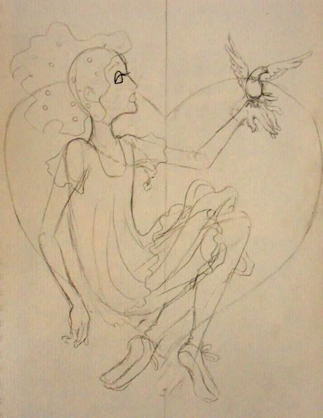
1st Step: sketch
Every picture starts with a sketch :) If I feel like it, I first skribble some concept sketches in a sketchbook or on a loose piece of paper, but more often I just sketch on the drawing paper.
For sketching, I like to use a mechanical pen, strengh 0,5mm, 2B. The lines are dark enough to look nice but I can still erase it easily.
About the paper, I used for this drawing: For mixed media techniques I recommend to use thick drawing paper, around 200g, with a nice paper structure. For this drawing, I used a very nice yellowish paper with a very heavy structure.
2nd step: lineart
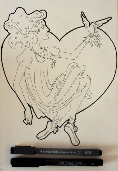
If you use copic markers or other alcohol based markers, you should use an alcohol proof pencils or ink to draw your lines. I didn't, because I don't have them at the moment. I had to work really careful with the markers so the lines won't bleed out.
How you line your artwork is a question of personal style :) I don't want too dominant lines in my final drawing so I made the inner ones very thin and just framed the whole thing with a thicker line.
3rd step: pastel chalks
That's a fun part *laughs* I create a color base with pastel chalks. I just put the color on the paper and blur it with a paper tissue. If you don't know, how to do it, maybe practice how the colors mix on a second piece of (the same) paper. As you can see, I used two very different kinds of pastel chalks which react completely different.
The light orange one is very very soft and easy to smooth. Although the paper has this heavy structure, the soft chalk dust goes everywere and the structure is not visible.
On the opposite the hard red chalk. That one is not so easy to smooth out. The structure of the paper is clearly visible. I really like that effect, that's why I chose the paper. The structure won't be that visible if you use paper with a normal surface, of course, even if you use hard pastel chalks :)
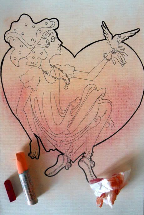
The nice thing about pastel chalks is, that you can erase them with a normal eraser! I take the color away from her face and arms because I'm afraid it will become too dark if I add a layer of markers.
If you don't like the idea, that this pastel chalk base coloring will be still visible when you add other layer of color, you can erase them from your whole drawing. I like the effect, that's why I just erase it in the skin parts.

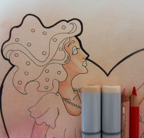
4th step: skin
I love to do skin, that's why I always do it first *laughs* I didn't take detailed pictures while I did the skin, there will come a more detailed description about my technique later. But you can see in the picture, what colors I used.
5th step: hair
I first color the whole shape with one copic color.
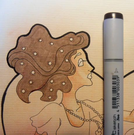
I draw some gradients and shadows with color pencils. Note, that I never use real black for my colorings. My favorite color pencil is a really dark blue which looks really nice with the light pinkish and yellowish colors I want to color this drawing with.
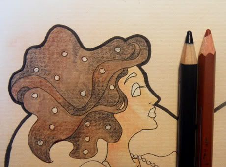
I take the brown basic color and start to smooth the colors. If you put a second layer of copic color on a dried first one, it becomes much darker, which is a really nice effect. In this case, the dark brown is too dark for my taste so I just use it in the darkest places of the hair. I smoothed out the rest with my skincolor. I like the fact, that it adds a slighty warm yellowish shade to the cool brown. For this purpose, you can also use the copic colorless blender (which I don't have). Important is, that you work in this step very loose and fast so you get nice smooth gradients.
In the end, I take my fleshcolored color pencil. This step adds another layer of warm color on the cool brown so it works better with the skincolor. I also think, the coloring looks much smoother and creamy after this step.
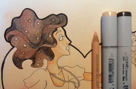
6th step: skirt
I documented the skirt quite well so maybe it's easier to understand my coloring technique here then in the last step.
Like in the hair, I first color the whole shape with a basic copic color. Then I add gradients and shadows with color pencils.

I take the basic color and smooth the color pencils. In this picture you can see the difference between the smoothed parts (under her knees) and the parts I didn't treat yet. The smoothed parts look almost like water color while in the other parts, the paper structure is still quite visible.
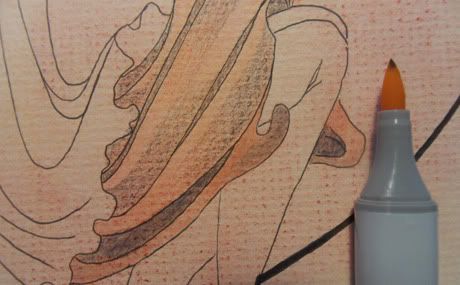
Here I did the whole skirt.
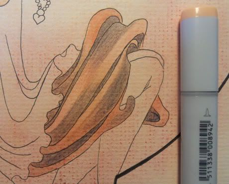
Again, I use the flesh color to make everything even more smooth and creamy.

7th step: dress + jeans
The same procedure with the dress: Basic color, and shading with color pencils.
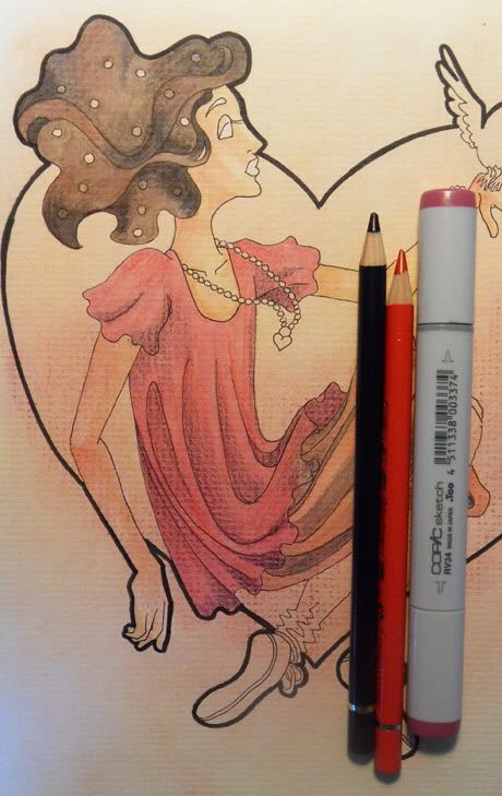
Smoothing everything out with the flesh colors.
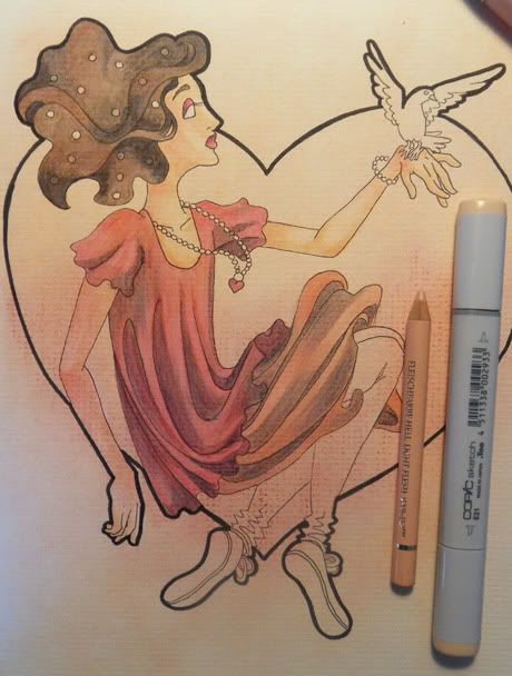
I do the same thing with the trousers. As you can see, the technique also works with the very cold blue. It makes it look warmer and it fits better with the other colors.
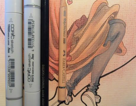
8th step: detail
Some small detail, like the shoes and the bird are still missing, so I do them in the same way. That's how the whole picture looks now:
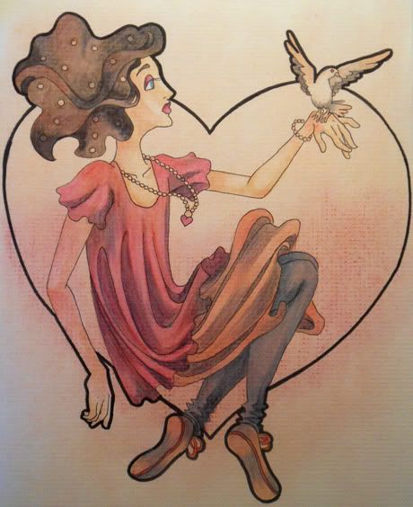
9th step: background
The heart in the background looked dull so I took my fleshcolor and just added a layer. I worked from the bottom to the top so I can make the pastel chalk gradient a little bit nicer.
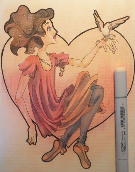
10th step: white
I take a very small brush and my opaque white to add highlights. I have a very nice white from Deleter, which is meant for Manga drawing. It's very covering although it's so liquid and it's nice to paint with it. Of course you can also use every kind of other opaque color like acrylics.
The white highlights look very nice on the yellowish paper.
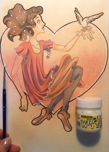
11th step: red lines
I think, the black lineart is still too hard for the light coloring so I take my red color pencil and draw the lines again with it. The whole thing looks softer now. I also drew a pattern in her skirt with the pencil.
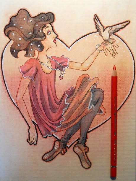
DONE :)
I'm finally satisfied with the picture. I really like how the colors work together. It's not a monochrome picture, I used brown, pink and blue in it, but because of my mixed media technique, the whole thing works.
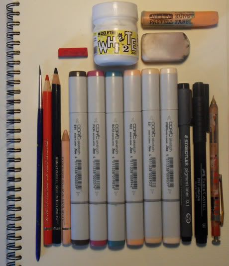
A little bit more about the drawing material I used:
- Soft and hard pastel chalks (I like the soft ones more)
- Deleter opaque white (+brush)
- Eraser (It would be nice, if I also had a smaller one) and mechanical pen (0,5mm, 2B)
- Color pencils (I'm in love with Farber Castell's Polychromos! They're expensive but worth every cent. My technique only works with soft color pencils so if you don't have Polychromos but water color pencils, they should also work fine).
- Markers (I use mostly Copics Sketch, because I love the brush pen. I also had good experiences with Neopiko markers! There are other alcohol based markers, like Touch, but they don't have the brush pen as far as I know.)
- Multiliner (the thin one is from Staedler, 0,1mm, the other one is a brush pen from Farber Castell)
As you can see, I used a very limited amount of colors for this drawing, which I really like. Esecially when it comes to the colors I use for the shading, I always try to limit myself so the whole drawing doesn't become too colorful.
Here is the final picture:

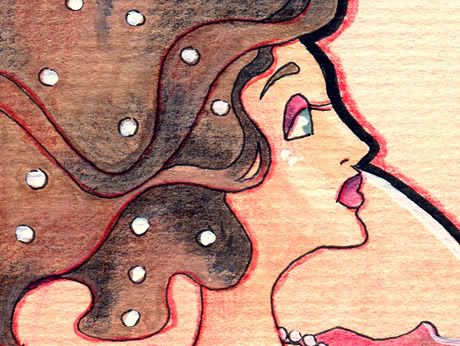
And a detail. I really love the texture of the paper :)
Ok... I hope, the whole thing was interesting for you :D If you have questions about my technique or my material, don't hesitate to ask.
Have a great day <3
Kathi

Oh cool! Makes me really want to pull all my traditional media out of my dusty drawers! How big is this artwork?
AntwortenLöschenxx
Hey :D Yes, do that X3 The artwork is A4 (8x12 inch)!
AntwortenLöschenI LIABS!!!!
AntwortenLöschen