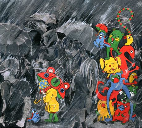
I finished my first bigger illustration this semester! It is a cover suggestion for the fourth volume of our university's Comic project Strichnin. Maybe you remember, but I also did some suggestions for the last one and I did also a whole comic story for it :)
This time the subject is "found" but actually it's quite open, what kind of motiv we want to do. So I did this:

The composition may look a little bit odd for a comic book cover. My idea was, that you can only see the left part with the girl and the little monster, when you open the book there's a flap you can swing out where the pile of little monstes is hidden :)
I have to admit, it's not a million doller idea *laughs* But I felt like painting something colorful, cheerfull and cute so I just did it.
It's done with Acrylic colors and color pencils on grey cardboard! I plan to go a little bit more analogue this year because I love to have the original final painting in my hands. That's something you can't have in that way when yo paint digitally :(
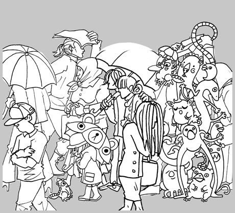
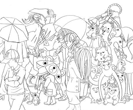
OK... I also have some WiPs for you this time because while the execution is completely analogue, I also did some steps digitally:

For example the sketch! I drew every person seperately and made the compositing digitally! Then I printed it and traced them on layout paper to get some nice and chrisp outlines:

I scanned them again and made a digital color sketch to get an idea how the final thing could look like and to show it my illustration professor so he can help me with some critics :)

With his help, I decided to make the peolple in front of the monsters a little bit bigger so the picture doesn't look so flat any more.
I traced the Lineart with chalkcoal paper on the cardboard and started painting like crazy *laughs*
That's it :)
I really hope you like it.
Bussi
Kathi

Keine Kommentare:
Kommentar veröffentlichen